OCC Clean & Simple 3 – Days 7 & 8 – Creative Coloring: Tracing Images

The card by Tasnim Ahmed is totally spectacular!  I struggled with finding an image with which I could replicate her technique.  Most of my backgrounds are either very simple or very,very detailed – as with the Impression Obsession C-A-C Roses background which I used on this one layer card.

Image

created by Stephanie S. Bush @ inkyantics.wordpress.com

In tracing the image, much of the original detail got lost.  However, I like the contrast between the traced images and the original stamped images in the background.  I used copic markers to color the image and a Uni-Ball Signo gold gel pen for tracing. Need to get hopping on the housework for a bit before trying some more “homework”! Hugs!

OCC Clean & Simple 3 – Days 7 & 8 – Creative Coloring: Simple Copic Coloring

One of the creative coloring techniques presented in class is simple copic coloring.   Essentially, you color with copics on vellum so that it shows through a die cut window of the card.

I chose two dies with which to create the windows on the panel of the card.  First, I cut the word “hugs” and then, I partially die cut the flowers from the top of the panel, down to the tip of the “u” in hugs and then, cut the die from the bottom of the panel up to the “g” in the word “hugs”.   As I am looking at the card now, I realize I probably should have extended the cut between the “u” and the “g”. Oh well.  It is just practice. 🙂  I still think it turned out quite lovely!  And at first glance, I doubt anyone would notice…. I certainly didn’t as I was creating it.

I colored with copics.  I used the brush end to “dot” color over the letters.  I used the darkest color of each set on the words and two of the lighter colors on the stems and flowers.

Creative Hugs

created by Stephanie S. Bush @ inkyantics.wordpress.com

On to more “homework”!  I just love “homework”, don’t you?  It sure as heck beats doing housework!!! Hugs!

OCC Clean & Simple 3 – Days 5 & 6 – Backgrounds into Foregrounds: Graffiti Stamping

I have to say that I have NEVER seen graffiti as pretty as Shari Carroll demonstrated on her card!! 🙂

To be more authentic in regards to “graffiti”, I intentionally (yea, right!) went for the more messy variation! (if you believe that, I have some ocean front property here in Oklahoma!).

While I did intend to put the sentiments at a slant (honestly, I did!), they weren’t lined up very well (in my opinion).  So, to “fool the eye”, I added the stitching pattern over the entire thing!  This helped it to look more “graffiti-ish”, IMO! 🙂

Image

created by Stephanie S. Bush @ inkyantics.wordpress.com

I am off to do more “homework” and then some housework (yuck!).  Hugs to all!

OCC Clean & Simple 3 – Days 5 & 6 – Backgrounds into Foregrounds: Iron-Off Embossing

Days 5 & 6 of  Online Card Classes’ Clean & Simple 3 class have come and gone, but everyone still has a chance to get their “homework” into the gallery until the end of next week.  These two days focused on  “Backgrounds into Foregrounds” and included Iron-Off Embossing, Masked Backgrounds and Graffiti stamping. 

The following card incorporates the Iron-Off Embossing technique in the sentiment.  I learned a couple of things doing this card – first, the Zig embossing pen, at least on watercolor paper, tends to stay “blue” (it’s my understanding that it’s supposed to  turn clear once embossed!).  The second thing I learned – is that even with a ruler, I still can’t draw a straight line!!! lol

First, I stamped the butterfly image with gold ink and heat embossed with Ranger’s Pale Gold embossing powder. I stamped the sentiment with Versamark and embossed with clear embossing powder.  In order to give a “boundary” to the watercolor background for the sentiment, I drew a border around the sentiment with the Zig embossing pen (which has a blue tint so that you can see what you are drawing/writing).  Then, I heat embossed with clear embossing powder.

After watercoloring the butterfly and the background around the sentiment,  I ironed off the sentiment and the border around the sentiment.  That is when I discovered the line around the watercolor background was still blue! Well, I haven’t crafted all these years without figuring out how to cover-up mistakes!  So, I took the 1/8th” Sookwang tape and put it over the blue lines around the sentiment, and applied glitter!  I was pleased to see the effect it gave the sentiment — the whole area looks “recessed” in relation to the butterfly. Pretty cool!  I applied some sequins for texture (and to cover up a few little water color splats! 

This is a rather large card – 4.75″ x 7″.  It’s one of the 5″ x 7″ Strathmore watercolor cards which I trimmed down a bit.

Image

created by Stephanie S. Bush @ inkyantics.wordpress.com

Hope everyone else is getting their “homework” done and into the galleries!  I love looking at all the great ideas! Hugs!

OCC Clean & Simple 3 – Days 3 & 4 – Optical Illusions: Masking

OK…..WHAT WAS I THINKING!!!  BLACK embossing paste on WHITE cardstock!  That’s a recipe for disaster and frustration in my book! lol  The card-making spirit was with me yesterday and today as I finished this card.  I did manage to get some of the black embossing paste on the bottom right corner of the card, but I let it dry and then scraped it off with an XACTO blade.  The only other mishap was the stamping of the label, where I was off a little on the left side of the area I had masked off with the die cut.  It really does give the illusion of another dimension on the card!

Image

by Stephanie S. Bush @ inkyantics.wordpress.com

Here is a side view of the card — the black embossing paste is very glossy!

Image

by Stephanie S. Bush @ inkyantics.wordpress.com

Supplies:

  • Memory Box stencil – Rhapsody (Style 88515)
  • Dreamweaver Glossy Black Embossing Paste
  • Distress Inks (Peacock Feathers, Picked Raspberry, Mowed Lawn)
  • Neenah Solar White Cardstock
  • Paper Smooches Streamers (dies)
  • Paper Smooches Streamers (stamps)
  • Sentiment from Hero Arts Essentials Messages set (CL371)
  • Archival Ink – Magenta Hue

Now it’s off to see what more is going on in class!  Catcha later! Hugs!

OCC Clean & Simple 3 – Days 3&4 – Optical Illusions: Scenes

Julie Ebersole’s card for this class is totally awesome!  Unfortunately, I really don’t own any sets that lend themselves to creating scenes “with distance”.  Hmmmm.  I did have a boat stamp set, and I attempted to do as Julie instructed.   Not sure how I feel about this card…

By Stephanie S. Bush @ inkyantics.wordpress.com

By Stephanie S. Bush @ inkyantics.wordpress.com

Supplies:

  • Neenah Solar White cardstock
  • Ranger Archival Black ink
  • Flourishes A Guiding Light stamp set (www.flourishes.org)
  • “Watercolor” – Memento Inkpads (New Sprout, Dandelion, Toffee Crunch, Summer Sky, and Desert Sand)
  • Washi tape

Hope everyone is enjoying class! Hugs!


Online Card Classes – Clean & Simple 3 Has Begun! Homework for Days 1 & 2

I am off on a new adventure, well – a class really, with the gals at onlinecardclasses.com for their third Clean & Simple card classes. yea!!!  Making clean and simple cards is harder than you think!  I love these classes as the ladies always have something great to share and lots of tips and tricks.  The class started this past Monday and, as usual, I am already behind on the “homework”!  The first two days of the week covered different “faux” techniques.  Here is a single layer card I designed using silver embossing powder as “faux” metal for the sentiment and flower embellishment in the corner.

Image

by Stephanie S. Bush @ inkyantics.wordpress.com

Supplies:

Have a splendid day!  More posts to come!

Holiday Card Workshop 2013 – Homework for Day 5

Day 5 is all about holiday cards designed for a male versus a female recipient.  Masculine cards tend to be less “fussy” – embellishments are minimal, color schemes are darker and more subdued. Feminine cards can be very ornate, soft and bright with no limits on embellishments!  You can even throw on the kitchen sink! lol

I chose to use the same card design on each of the cards, as well as the same stamps.  On the masculine card, I heat embossed the focal image with white embossing powder on the brown cardstock giving texture and dimension to the image.  For the feminine card, i just stamped the image on white — this gave a lighter and more “feminine” look as the lines of the image are very delicate looking, as compared to the masculine version.

For the background, I used the same stamp on both – but for the masculine card, I heat embossed with white embossing powder which gave a more matte look to the snowflake background. For the feminine card, I used a Prisma glitter embossing powder giving more shine and glitter to the background.

Here are the cards –

His & Hers Holiday

The sentiment inside both cards reads “Wishing You All the Wonder and Magic of Christmas”.

HIS Supplies:

  • Card Base – Gina K. Chocolate Cardstock
  • Layers – Papertrey Ink cardstock, inside – Neenah Solar White
  • Stamps – Stampendous! Winter Chapel Stamp, Rubbernecker Stamp’s Snowflake Panel, (inside) Hero Arts Magic of Christmas (CL462)
  • Dies – MFT Dienamic Blueprints 2 (banners), Lil Inker’s stitched circles
  • Punch – 2 3/4″ circle punch
  • Ink – Ranger Archival Coffee Ink (inside/outsidesentiment), Versamark
  • Other – Stamp n’ Stuff Detail White embossing powder, American Crafts ribbon

HER Supplies:

  • Card Base – WPlus9 Cranberry Crush Cardstock
  • Layers –  WPlus9 Cranberry Crush Cardstock, inside – Neenah Solar White
  • Stamps – Stampendous! Winter Chapel Stamp, Rubbernecker Stamp’s Snowflake Panel, (inside) Hero Arts Magic of Christmas (CL462)
  • Dies – MFT Dienamic Blueprints 2 (banners), Lil Inker’s stitched circles
  • Punch – 2 3/4″ circle punch
  • Ink – Adirondack Cranberry Pigment Inkside/outside sentiment), Versamark
  • Other – Judikins Sticky Stuff, Prisma Embossing Powder, Velvet Ribbon from Papermart.com

Hope all is well with you and yours! Hugs, Stephanie

OCC Summer Card Camp 2 – Week 3, Day 2

Today’s class, at onlinecardclasses.com,  revolved around die cutting techniques – embellishing die cuts or punched/hand cut shapes. Techniques included embossing cut shapes, cutting patterned paper,  using cut shapes as backgrounds, and color blocking with cut shapes.  For those of you who may not have dies — hand cut your shapes!  Dies are simply a tool to do things faster and easier.  You can do the same thing by tracing or drawing a shape onto paper and then cutting it. 🙂  Don’t feel like you have to go out and buy every die you see demonstrated in the hundreds of youtube videos!  You’ll end up in debtor’s prison! (don’t ask me how I know! lol)

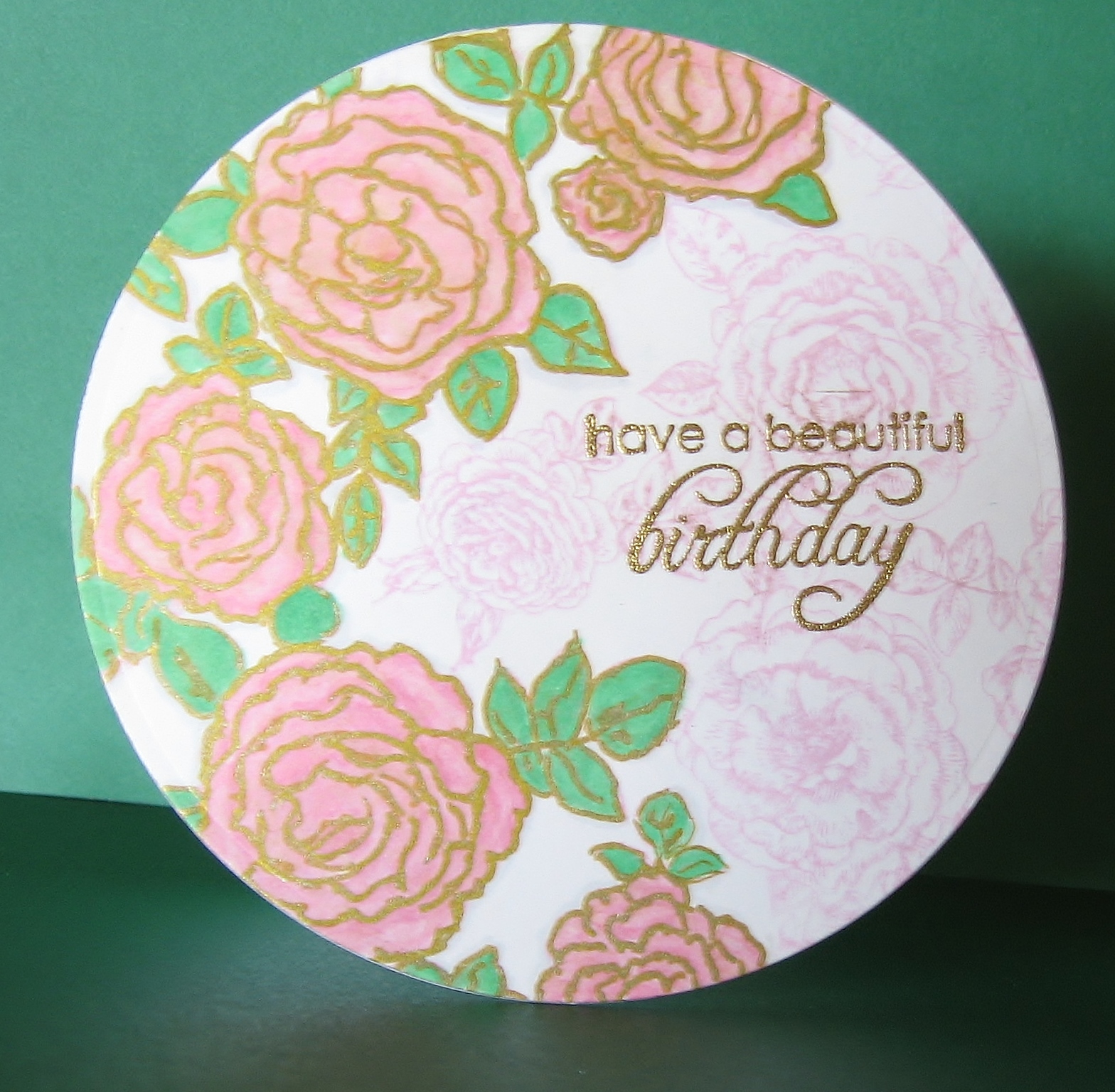
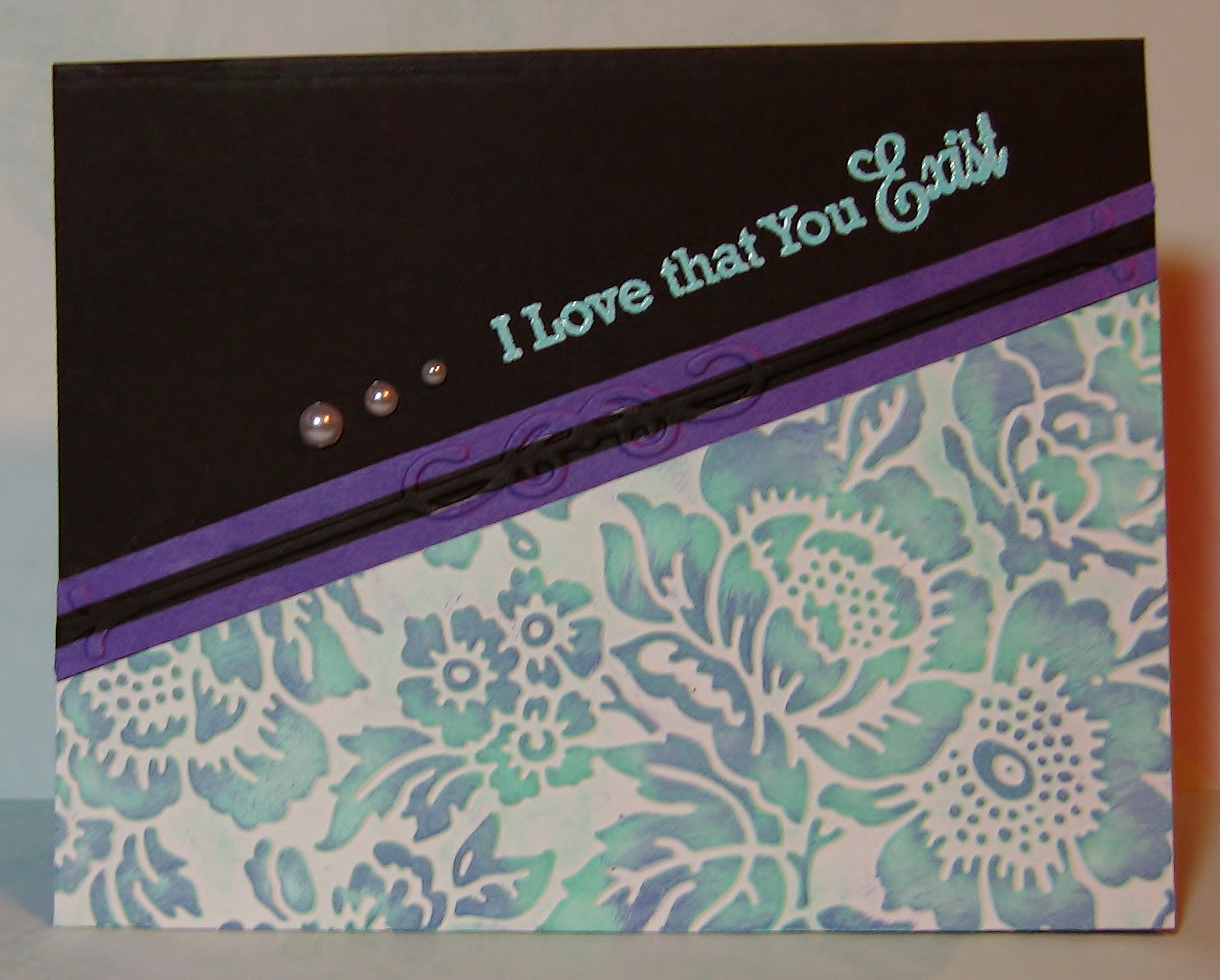
I’m feeling a bit low on the ol’ creative mojo today, so I fell back onto some old tried and true techniques using our color combo. As Jennifer suggested in class today, I am substituting gold tones for the brown tones in the color combination. Using a Sizzix Floral Flourish #2 embossing folder, I embossed a panel.  On the embossed images, I used an embossing pen and – working in small sections – colored with the embossing pen and then used Rangers Ancient Gold Antique Gold embossing powder on the leaves and flourishes.  On the flower bud and flowers, I used the embossing pen, and then applied Judikins Sticky Stuff and heated just until sticky – this way I could more easily apply the chunkier Stampendeous Jewel Encrusted embossing flakes – in various sizes and shades of purple.  Then, I used Pebbles Pearlescent chalks to  highlight the flowers and used the lightest blue pearlescent chalk for the background — it’s very subtle but pretty, up close and personal! 🙂  I set the chalk with Spectra Fix Pastel Fixative (it’s all natural and odor free – a great product).

Image
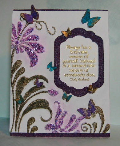
I die cut a window into the panel using Spellbinders Labels Eleven die. To incorporate today’s lesson, I then die cut a frame to fit in the window with dies from the same set.  Using Distress Embossing powder in Dusty Concord, I heat embossed the frame – twice.  Additionally, I did the same to two strips of cardstock which you see on the top and bottom of the card.

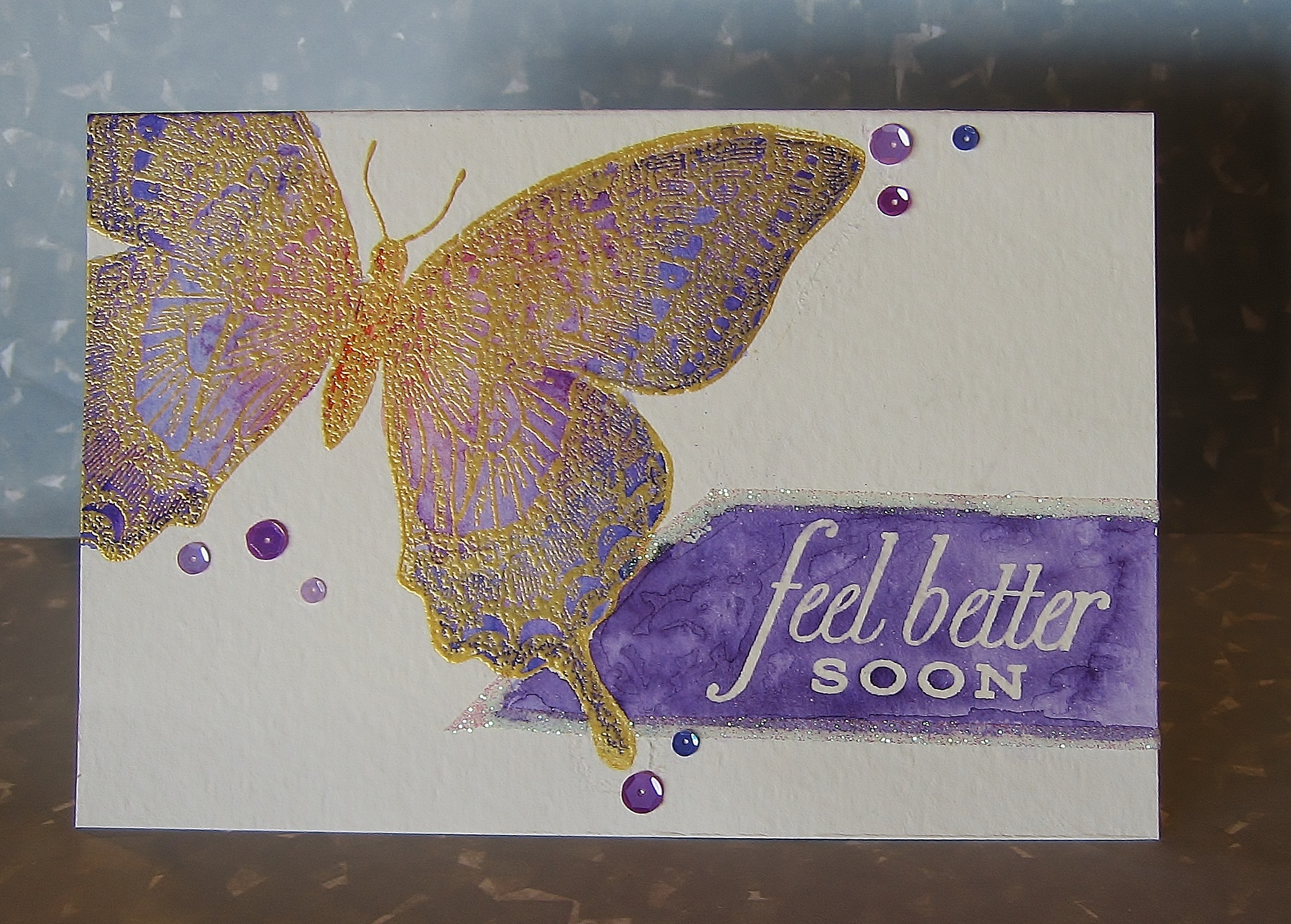
The butterflies are punched with a Martha Stewart punch – out of purple and blue mulberry paper.  Using Ranger’s Super Fine Detail embossing powder in Gold, I embossed one side of the mulberry paper butterflies entirely in gold -look at the two small butterflies nearest to the sentiment.  However, when I flipped some of them over, I loved the “mistakes” of gold on the backside of the mulberry paper.  So, the other butterflies are completely gold underneath with splotches of gold on their wings. I love it when mistakes are so pretty! lol

The sentiment is also embossed, on the card base,  in Ranger’s Super Fine Detail embossing powder in Gold and is from Gina K.’s You Go, Girl! stamp set by Tami Mayberry.

The panel was placed over the sentiment with foam tape, and the butterflies were adhered with Glossy Accents.

Hope everyone is having fun! I’m going back to bed – for a nap! Hugs!

OCC Summer Card Camp 2 – Week 3, Day 1

It’s the start of a new week over at onlinecardclasses.com, and you know what that means….. new sketches and color combination!!! So let’s get crackin’!  Deciding on a sketch was tough as they all three were so well put together, so after doing eeny-meeny-miney-mo, I picked the 3rd sketch! lol

ImageFor the card base, I chose Gina K’s Pure Luxury Dark Chocolate for the brown in the color palette.  Since we were only required to use 4 of the 5 colors, I used 2 shades of purple, aqua blue (and as just mentioned – the dark brown) – so there is no light brown on this card.  The three accents in the sketch I chose to move up and place by the sentiment – they are actually white, but I think they picked up some of the brown in the reflection in the picture.

The bottom portion of the card is Neenah Solar white cardstock which was dry embossed with an Anna Griffith embossing folder.  I then used Versamagic Dew Drop ink pads to lightly color the embossed images.

This is a lovely color combination, and I am looking forward to playing with it some more over the next few days!  Hugs!