Happy Valentine’s Day Everyone!

I hope everyone is taking time to enjoy today with your loved one or loved ones or treating yourself to some pampering of your choice!  I’m taking it easy … just “chill-laxing” in my recliner and watching some movies, with the yorkies in my lap — possibly ordering in a nice hot pizza. Life is good!

I thought I’d share the Valentine’s cards I made.  Since the recipients should have received them by now, I thought it appropriate to share some cardmaking love with you all!

Please forgive the wonkiness of the photographs – the cards were all made straight, but the angle by which I took the pictures is odd in some cases.  I am working on my photography skills and saving for a new camera.  I am currently using my cell phone.

These first three were made for my great-niece and great-nephews.

EmmasCard MaxCard ZachsCard

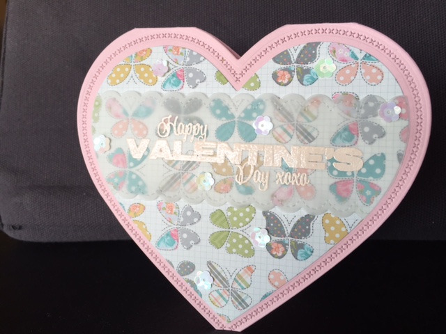
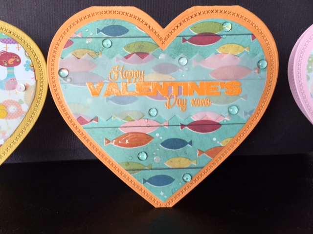
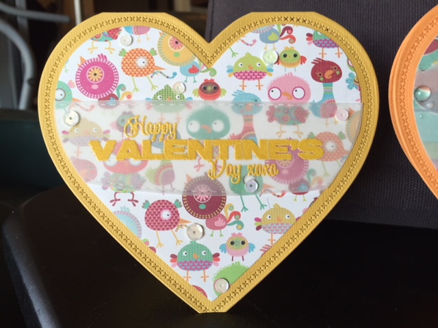
The card stock for the bases is from Gina K. Designs.  The patterned paper is from my stash. The sequins are from http://www.ccartwright.com. The card base was die cut with Little B’s Hearts die set – fabulous set!  You can cut or just emboss or cut AND emboss with this set. The card was cut with the largest die and embossed with the next largest die. Love it!  The sentiment is from Impression Obsession’s Valentine Hearts set.  It was stamped with Versamark Ink and set with various Zing! embossing powders to match the cards.

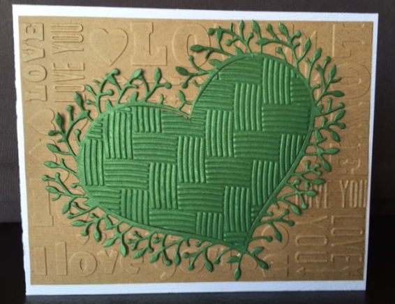
These next cards, I call a “companion set” as I switch die cut elements between the two cards to get different looks.

Austenscard TylersCard

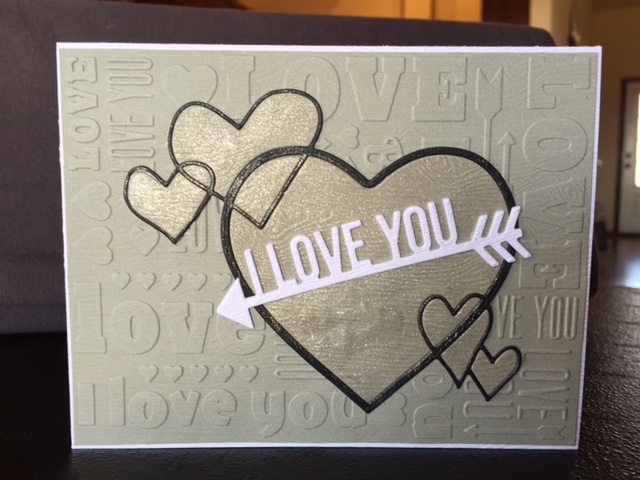
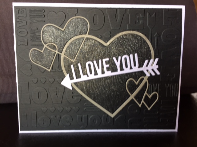
The embossing folder used in the background is from Lifestyle Crafts Sweetheart embossing folder set.  I use this same embossing folder in another card in this post, but with a slightly different twist.  The hearts and frame around the hearts were cut in the same colored cardstock as the embossed piece – however, the frames where switched between the two cards – providing contrast to the background.  The die used is Memory Box’s Heart Ensemble.  The arrowed sentiment is from My Favorite Things Die-namics Straight To My Heart die set.  All papers are wood grain embossed.  The card base is paperandmore.com’s Woodgrain Limba White cardstock #111 – best wood grain cardstock on the market, IMO. The colored wood grain cardstock is from Taylored Expressions.  I used Zig’s clear Wink of Stella to add shimmer to the hearts on both cards. I chose these color schemes as my sons are in their 20’s and not into the flowery, mushy valentine’s stuff (although I did slide in some glitter! lol)

These next three cards use Memory Box’s Woodland Heart Frame die to create simple, yet elegant cards.

AmosCard WoodlandHeart WoodRose

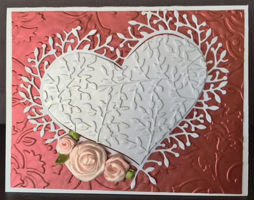
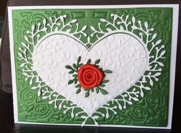
To vary the look of the cards, I used different colored cardstocks and embossing folders for the backgrounds.  For the card on the left, I used craft cardstock embossed with the same folder used above – Lifestyle Crafts Sweetheart embossing folder.  I also embossed the center heart with Darice’s Basketweave folder.  This makes for a great valentine’s card for any man in your life. For the middle card, the background is embossed with Spellbinders M-Bossibilities Enchanted Design B. I pieced cuttings from several die cut branches using C. C. Designs Leafy Branch.  This added more texture and interest to the card front.  The ribbon flowers are from Papermart.com.  For the card on the far right, the green card stock was embossed with a die – Spellbinders Nestabilities A2 Filigree Delight.  The heart was embossed with Elizabeth Craft Designs Spring Leaves folder.  The ribbon flower is from Papermart.com.  Card bases are Neenah Solar White cardstock.  The red cardstock is paperandmore.com’s Crimson Red Metallic105# 5×7.  The green cardstock is paperandmore.com’s Metallic Botanic Green — it’s absolutely beautiful in person.

These next two cards used the same die, but in in different ways.

RedBtrflyHeart StripedBtrfly

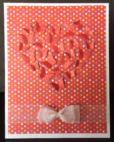
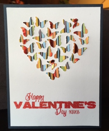
The card on the left, used Memory Box’s Butterfly Heart as  designed – it cut the outline of the wings so that they can be lifted up for dimension.  I used Zig’s Wink of Stella in red to paint the wings to add more contrast.  A piece of blue vellum was put on the back for contrast.  The gauze ribbon is from papermart.com – the most economical way to buy ribbon.  (Hint, buy ribbon in either white or cream and use your paints or inks to color them to match your project!)  The card on the right also uses Memory Box’s Butterfly Heart die – however, this time I used my craft knife to continue cutting each of the butterflies out and placed them on a  white card base.   The sentiment is from Impression Obsession’s Valentine Hearts set.

Because it is getting late, I will wait to share the remaining  cards tomorrow! Take care and sweet dreams!

Hugs,

Stephanie

OCC Summer Card Camp 2 – Week 3, Day 5 Homework

Hey all!  Here is my homework for yesterday’s class — yea!!! I’m all caught up on the homework!!! I’m so thrilled!  While yesterday was the last day for homework at Summer Card Camp 2, we do have a wrap-up day on Monday – I’m keeping my fingers crossed that I win some juicy prize! lol  (Just as I am sure the other several hundred participants are doing!)

I chose the first color palette from Friday to do my card in — on my computer monitor the colors look like white, orangish-yellow, red and two shades of blue.   I know the fabulous Julie Ebersole interpreted it as yellow – and even though the teacher is ALWAYS correct <grin> – I decided to interpret it as orange! Here is my card –

Image

I made my own faux windstream using one of the Snowdrift dies from My Favorite Things.  The hot air balloons were made with the Up, Up & Away set by Papertrey InK, along with the matching die set.  The clouds are also Papertrey Ink dies – Cloud 1 & 2.

Copics were used to color the images; and the sentiment was heat embossed with Zing! embossing powder.

Hope everyone gets to catch up on their homework assignments! Take care and hope to see you soon at another class in blog land, or please feel free to stop by whenever! Hugs!


OCC Summer Card Camp 2 – Week 3, Day 3

Back with yesterday’s homework for Online Card Classes’ Week 3, Day 3 lessons!  I was inspired, and reminded, by guest artist Lisa Spangler‘s  demonstration of splatting dabbers to get a somewhat controlled – yet messy look!  I think Paper Smooches sentiments go well with this technique due to the type of font. 

ImageWhile I like the look of the splatters, the card looks a little off balance to me. I think it’s because the splatters on the left are too lined up.  Well, I will do better next time! 🙂  In case you couldn’t tell, I used the 2nd sketch and our color combination — the brown is the ZIng! Chestnut embossing powder on the sentiments.  Instead of ribbon or twine in the center, I embossed three lines.

Hope everyone is enjoying their last week of camp! Hugs!

OCC Summer Card Camp 2 – Week 2, Day 5 Homework

Yes, today is Sunday – and the subject for today’s post is this past Friday’s homework at onlinecardclasses.com.  Our assignment, should we choose to take it, is to create something utilizing one of the six new color combinations.  The color combo I chose is the last combination which included white, a light blue, a darker blue, green and mid-tone shade of pink.  Using Jennifer’s method for the trifold card, I created the following card –

ImageThe lighter blue is on the strips on the sides of the cards and the darker blue is the sentiment which is embossed with Zing! Denim embossing powder.  Love the style of this card.   Before I made this card, I tried to incorporate the ink-carving method for the leaves – however, because the white spaces in the flower I used were so crisp and thin, the resulting ink-carved leaves looked kind of “cartoonish” next to the flower as the ink-carved veins in the leaves were much wider and less structured. So, I chose a different leaf for the card.  However, I did learn that the ink carving was doable on clear stamps with dye inks! Nice to have another technique in the tool belt, so to speak!

Hope everyone is having a fantastic weekend!  This ol’ gal is going to take a nap. 🙂 Hugs!

OCC Summer Card Camp 2 – Week 2, Day 4 (Non-Holiday/Holiday)

Today’s homework in Summer Camp 2 (onlinecardclasses.com) is to use any holiday stamps/supplies in a non-holiday fashion!  I didn’t have much time to spend today on making a card as I had several doctor appointments.  However, since the card I made is “one for the boys” – they don’t like a lot of “stuff” on the card anyways! lol

I have a great Hero Arts Christmas set – Jolly (CL620) – which has three big words on it — Jolly, Merry and Peace.  Guess which one I used? C’mon, guess! I bet it’s staring you right in the face!  I’ll give you a hint — I’m a 60’s girl!  If you guessed “Peace”, then rock on dude! (or dudette, whichever the case may be!)

ImageI’m not sure where I got the “dude” stamp – it was one out of a clearance bin a long time ago, and I don’t recall the manufacturer.  I used Memento markers direct to the stamp, misted the stamp and stamped over the heat embossed “dude”. If you’ll notice – I managed to get all the colors in our color palette in the word “PEACE”! Then, I dry embossed the piece in a Sizzix Leaves embossing folder (657398).  The card base is brown as is the word “dude”. Easy peasy!

Hope everyone is having a bodacious day! Hugs!

OCC Summer Card Camp 2 – Week 2, Day 3 Shaker/Shadow Box Card

Today’s class was FILLED with a tremendous amount of material taught by awesome, talented gals –  Kelly Marie Alvarez, Julie Ebersole, Jocelyn Olson, Amy Wanford  and Pamela Ho!

I am totally enamored with Kelly’s shaker card from today’s class!  Inspiration to the max!!! lol  I just couldn’t wait to get crafty and make one for myself! Here it is –

ImageI loved the way Kelly made her own striped paper, so I did the same with the cardstock in brown and blue.  I stayed pretty well within the color palette, except for the centers of the flowers and the little bee (which was a button, and I removed the shank).  The bottom of the card has glitter in it (you can see it in the lower left corner) and good ol’ static cling of the acetate allows the glitter to adhere in places, which you can clearly see in the picture.

The craft foam I had on hand was really thin and self-adhesive. So, I cut three pieces of it with Spellbinders Label Eleven dies and adhered them to each other. Since, the result was about 1/4″ wide, I used 1/4″ scor-tape to go around the edges and add brown glitter so the foam wouldn’t show at the side of the card.  These next two photos show the card from the left side angle  and the right side angle.

Image

Image

Supplies used:

  • Stamps: Hero Arts Everyday Sayings set (CL342)
  • Papers: Neenah Solar White, Gina K. dark chocolate, blue raspberry, ocean mist and turquoise sea cardstocks
  • Punches & Dies: My Favorite Things Dienamics Blueprints 1 (stitched label die), Spellbinders Labels Eleven dies, Creative Time Dies (Stitched Daisy, Stitched Clouds, and Flower Petal Dies) found at http://www.creativetimeforme.com/,  Taylored Expressions Branches, Banners, and Bloom die set (leafy branch); various Martha Stewart butterfly punches
  •  Inks/Color Mediums: Versamark
  • Embossing Powders: Zing! Chestnut
  • Other: Scotch Glue with 2 way Applicator, Scotch ATG, Scotch Foam Tape,  acrylic gems, Dress Up! button(bee), Art Glitter

I am SOOOOOOO enjoying this class!  And, I love the homework! 🙂  Hope you are having a fabulous, crafty adventure! Hugs!

OCC Summer Card Camp 2 – Week 2, Day 1, Sketch 2

Might as well go for the gold and do all three sketches today! 🙂  So here is my third, and last card, for today (pictured shut) –

ImageThis second picture shows it standing slightly open –

ImageProducts used:

  • Stamps: Hero Arts Hello set (CL266), Impression Obsession C-A-C Tapestry 2
  • Papers: Neenah Solar White, Gina K. brown
  • Punches & Dies: My Favorite Things Dienamics Blueprints 2 (stitched label die)
  •  Inks/Color Mediums: Versamark, Distress Inks (Peeled Paint, Mowed Lawn and Salty Ocean, Tea Dye)
  • Embossing Powders: Zing! Leaf, Super Fine Detail Clear Embossing Powder
  • Other: Hemptique hemp cord – brown, buttons, Eclipse Masking Tape, Scotch ATG, Scotch Foam Tape

Till tomorrow! Hugs!

OCC Summer Camp 2 – Week 2, Day 1, Sketch 3

I gave the 3rd sketch a try; also incorporating the  watercolor technique from Kristina’s video. The three Distress Inks I used were Peeled Paint, Mowed Lawn and Salty Ocean.  I used Zing! Chestnut embossing powder for the “brown” in the color palette.

Since the Lil’ Inkers Stitched Circle mat dies were still out on my table, I used them to die cut the bristol paper which had been colored with the Distress Inks watercolor wash. I used a smaller and larger Spellbinders circle die to create the inner blue frame around the sentiment.  The sentiment is from CAS-UAL Fridays Breathe Stamp set.

ImageThe solid circles were popped up with dimensional foam tape. The open circles were taped down to the card front.  I love these colors together! 🙂

Hugs!

OCC Summer Camp 2 – Week 2, Day 1, Sketch 1

Hi all! I’m baaaaaaaccckkk! lol I’m caught up with the homework! Yee haw! (that’s the okie coming out in me!)

Our color scheme for this week is cream, brown, blue and 2 variations of green.  I have to admit, this is not a color combination that I would have picked out  myself – so it is definitely a challenge.  This is a great color combination, in my opinion, for male cards.   Here is my homework, using the 1st sketch, which Kristina so fabulously demonstrated in class –

Image

Products used:

  • Stamps: Hero Arts Star Wreath (CL555), Technique Tuesday Awesome stamp set
  • Papers: Gina K. Designs Christmas Pine (card base), The Linen Door 4.5″ x 6.5″ paper pad (second layer), Grafix Vellum in Surf (3rd layer), Grafix Vellum in Clear (sentiment)
  • Punches & Dies: Lil’ Inker Designs Stitched Circle mats, My Favorite Things Dienamics Blueprints 1 (stitched label die)
  •  Inks/Color Mediums: Versamark
  • Embossing Powders: Adirondack Bottle, Zing! Chestnut
  • Other: Hemptique hemp cord – brown